

Preceded by: pastel set
Succeeded by: red wings set
Ahead of its 18th series, commencing on 10th July 1989, Countdown underwent its first major production refresh. Surviving just two years, the set redesign saw the dynamic coloured tiles of the original style be substituted by a dreary brown configuration.
──────────
Title sequence
The launch of the set came hand in hand with a change of opening titles after two years. This instalment featured a number of elements seen for the duration of the sequence, including a revolving four-square chequered background in the style of a chessboard; a rectangular box at the left of the screen, which progressively filled up with a red bar; a green oval at the top right of the screen, which counted down the number of seconds left in the sequence and stepped closer to the bottom as each second elapsed; and finally, a series of red and white boxes at the bottom section of the screen, changing between different words that can be made from 'countdown.'
The beginning of this elaborate sequence opened with the letters from the word 'COUNT' individually flashing on and off the screen with the tempo of the music, after which a clock face briefly appeared to mark the 1–4 second period. The clock folded away and a numbers solution proceeded to be written, beginning with '100 x 5 = 500; 500 + 75 = 575'. Following this, the clock reappeared for 6 seconds (now indicating the 10–15-second segment of the countdown) before once again folding away for the solution to continue, stating '575 – 8 = 567; 50 – 17 = 33; 75 x 8 = 600'. After this, the letters spelling out the word 'DOWN' individually flashed on and off the screen in the same manner as before, and the numbers solution was completed with '567 + 33 = 600; 600 – 600 = 0.' The titles concluded with the chessboard gradually stopping and the red and white 'COUNTDOWN' logo swivelling onto the screen: 'COUNT' in red text in front of a white box, and 'DOWN' vice versa.
──────────
Set design
Devoid of the perpetual colour combinations that characterised the former style, the wooden set was noticeable for having periods of substantially darker lighting; in particular, during the Championship of Champions V tournament that took place in early 1991. The backdrop was the only element that livened up the studio by tinging different colours every so often, as it had done before. From its plethora of geometric flourishes, primarily triangular, it could be surmised that this design was inspired by the Art Deco movement, prominent in the 1920s and 1930s, albeit lacking the eccentric golden touches.
In this brief and seemingly forgotten era of the show, the set exhibited an abundance of wooden boards. These were accompanied by a number of jagged and slanted wall panels accentuated with green and white granite textures to offset the deluge of brown. Each of these wall pieces had horizontal grooves running through them. Underneath these sections were layers of a darker woodgrain, which separated the excess of tan on top from a stone grey at the bottom. An arched, metal rail was fixed to the top of the central wooden boards, with two shorter ones framing a rounded panel on the outer areas of the studio. The wooden set was constructed around a diamond-shaped platform, with a central void in front of the desks. A plan view of the platform's layout would have seen a similar resemblance to the inside of a baseball field.
This quirky design was the only one in which the desk was split into four smaller tables, therefore making it distinctive because its setup wouldn't be suitable today: in the instance of a player declaring the same solution as their opponent, they have to pass along their sheet of paper with the solution written on, so the distance between both players on this configuration would have made that difficult. The two inside desks were squarish, while the outer two were slightly longer in order to accommodate both members of Dictionary Corner — lexicographer and guest — on the left side, who sat together. On a related note, this was the first set in which the position of Dictionary Corner was switched with Richard Whiteley, who was previously stationed at the left side of the studio. The desks here were the most unusual out of all that have been seen on the show, featuring sloped fronts and numerous overhangs. The front faces had a triangular motif imprinted on them, which was overlapped by protruding strips of wood to allow for a stylish drop-shadow effect. On both sides of each table was a standing floor-mounted wedge block. The desks for the two contestants had their nameplate sitting on top, as well as a seven-segment display embedded into the front to show their score.
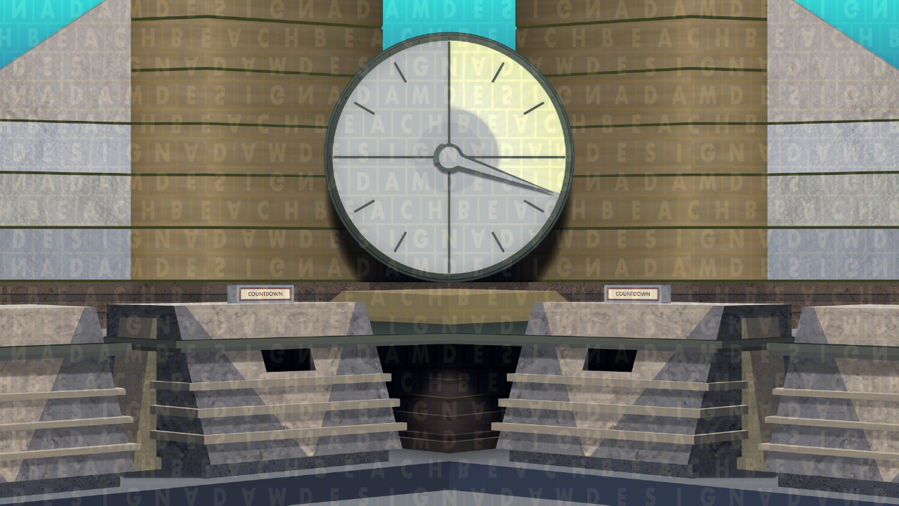
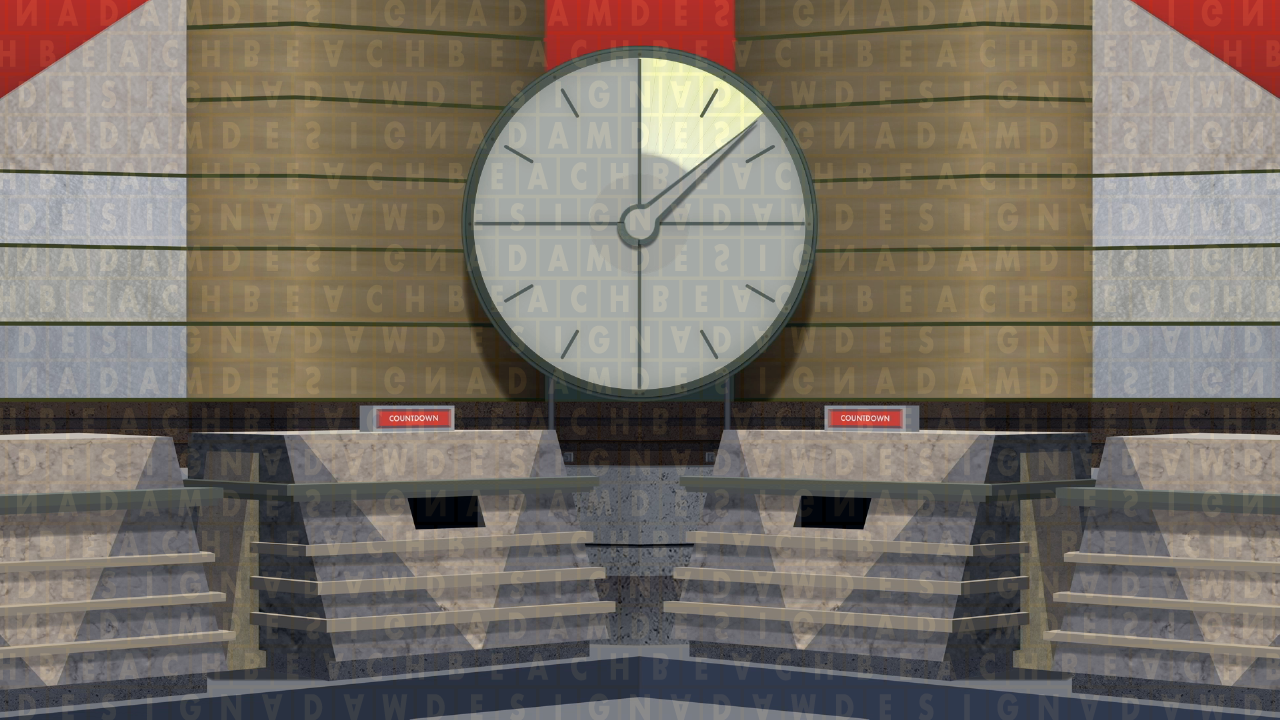
Reprising its role as the centrepiece of the studio, the clock now sat on a protruding pedestal, level with the darker woodgrain sections, and rested against the two wooden boards either side of it; it was supported by two legs fixed into the walls. Because of the boards angling inwards, the set lighting caused the clock to cast a prominent dark shadow onto them. In conjunction with the set using a bottle green highlight colour, the border of both the clock face and its hand were changed accordingly from the red colour they had been painted in before.
▸ Other changes: one of the additions for Series 18 was new clock music, which was recomposed to the version heard today. The first Countdown Masters series — broadcast between April 1989 and March 1990 — crossed over the pastel and wooden set designs, with some editions on the wooden set being filmed prior to Series 18. This likely resulted in the Masters series retaining the original clock music on this set, despite the newer version having already been introduced on the regular show.
▸ Later changes: the earliest observable difference made to the wooden set, just weeks after it entered production, was the removal of the central pedestal, on top of which sat a diamond-shaped prism object. The length of the pedestal significantly increased the distance between the two players, requiring a wider camera shot, so taking it away allowed the desks to be pushed closer together.
Midway through the set's tenure, the original clock hand was replaced with a "sharper" style, absent of the rounded corners of the preceding hand. This style has been retained since, though the hand lost the arc-shaped piece extending from the inner section when the clock model was rebuilt in 2013.
▸ Discontinuation: LONGEVITY is an unfitting nine-letter word to describe this period in the programme's history, as the wooden set was ditched after just two years. To date, it remains Countdown's shortest-lived set design, a record that it will likely keep. It was replaced by the red variation of the wings style when Series 22 commenced in July 1991.
1989 v4, with the central prism between the contestants
1989 v5, with the briefly used problematic colours seen on the nameplates
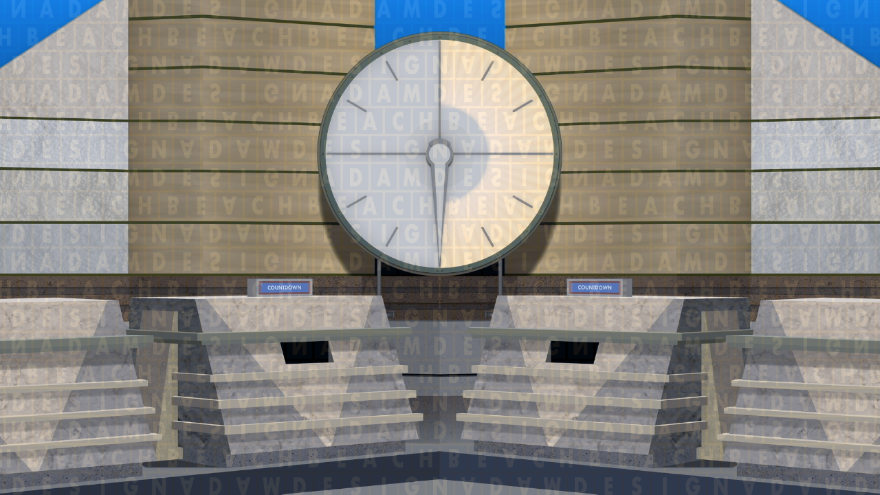
1991, with the reshaped clock hand
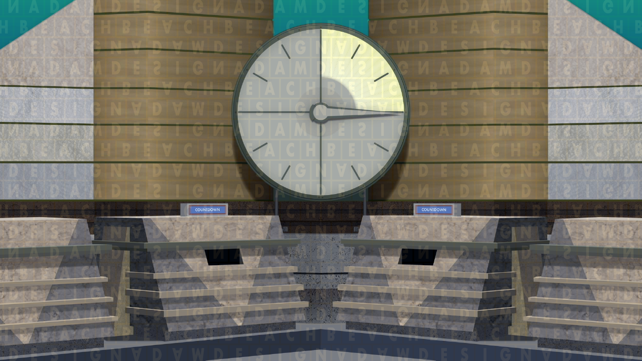
1991 v2
Examples of the clock shot from the wooden set
Screenshots from my 2018 uploads on YouTube, which are yet to be updated.
──────────
Letter and number tiles
In this era alone, the tiles displaying the letters and numbers had four different styles altogether, pertaining to problems with their colour scheme and later the font used.
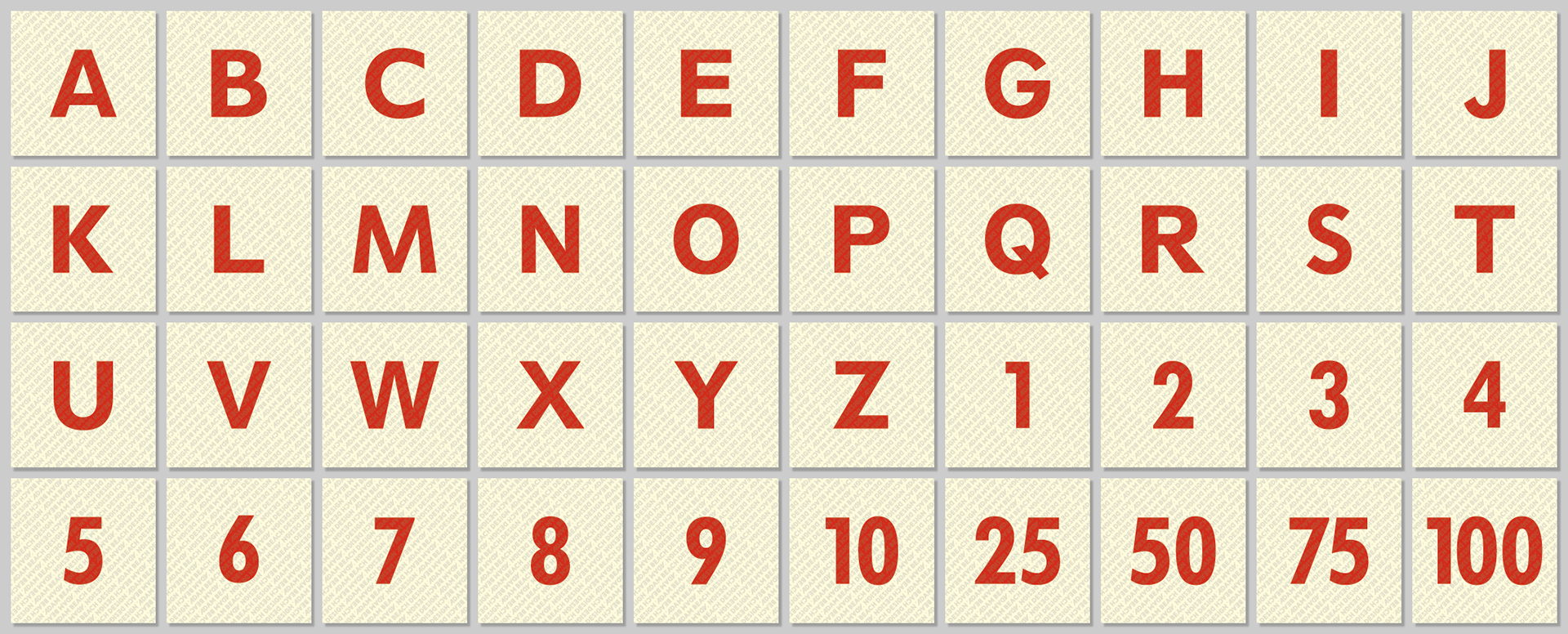
▸ Series 18: as well as the updated set, Series 18 introduced a new look to the letter and number tiles to match the appearance of the redesigned logo, with the type filled in red against a pale yellow background. The colour of the background somewhat gave the tiles resemblance to giant version of those used in Scrabble, which could have easily been the inspiration.
With only a single reference photo appearing to date, it's hard to make out what the precise composition of these short-lived tiles was. From examining the photo, taken during the first round of Episode 935, it appears the letters were roughly 20% smaller than those seen in other designs, perhaps for consistent height with the numbers. Typography wise, the characters look to have been set in the Bold weight of the verbosely named Twentieth Century Classified MT Std family; however, I only established this guess after pointing out the open counters of the 'B' and 'P' in the depicted selection, so it could be entirely wrong. Either way, the Twentieth Century typeface was released as a competitor to Futura, which Countdown later adopted in Series 20 and has retained since.
At the conclusion of the Series 18 recordings, it was pointed out that the colour combination of the tiles would be unsuitable for any viewers suffering with photosensitive epilepsy. Although attempts were made to have the entire series rerecorded, some of the original contestants weren't available. This resulted in many editions, notably in the finals, having to be broadcast with them in use. Those episodes that were filmed again reinstated the previous examples, introduced in Series 11.
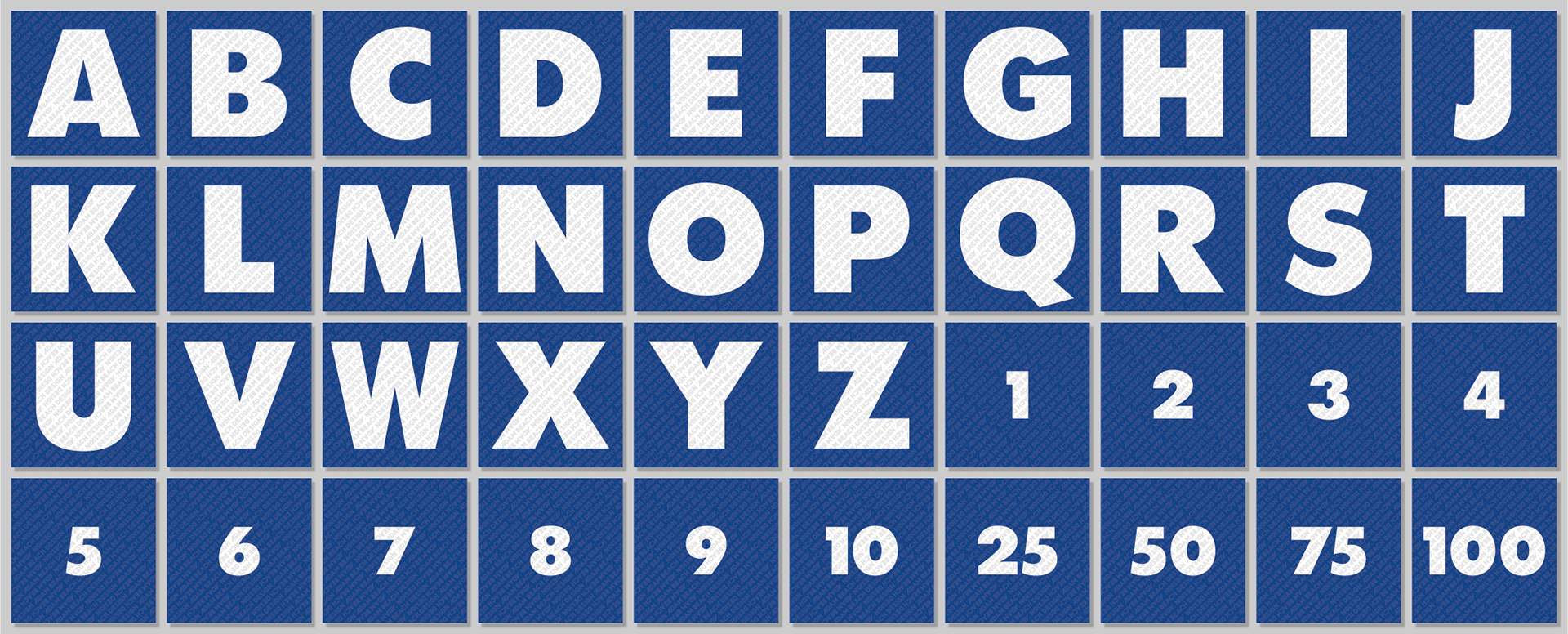
▸ Series 19: after the disaster of the original Series 18 look, the tiles were renewed again for Series 19. This was no better, however: in readability terms, their design was undoubtedly the worst look they have ever possessed. While the blue and white colour scheme was restored, the text was now set in what appeared to be the dreadful Twentieth Century Ultra Bold font. The thickness of this, combined with the height the letters were set at, meant the 'W' had to be condensed and therefore looked disproportionate, while the 'Q' had to sit above the baseline because of its descending "tail".
Given the situation with the red and white tiles, it was ironic that Twentieth Century Ultra Bold caused legibility issues for some viewers, deeming this design unsuitable also. To resolve this, they were replaced once again for the following series onwards; on this occasion, into the style still seen now.
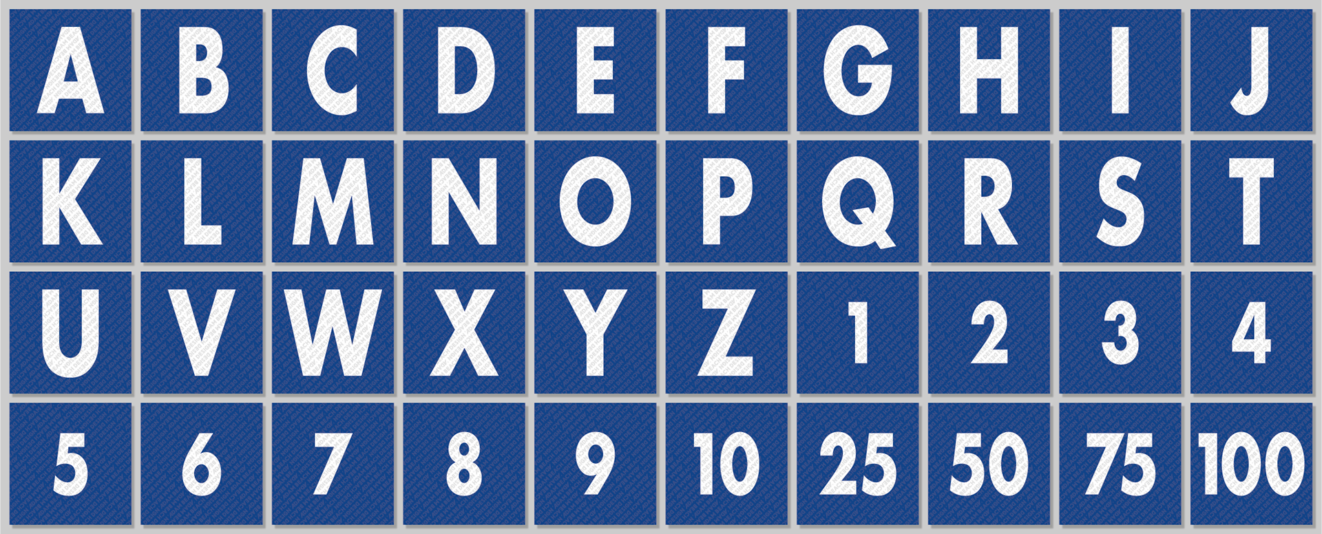
▸ Series 20 onwards: Series 20 was the first on the daytime show to involve the letter tiles that are still being used today — over 30 years on — although they could have made their debut in the midst of the early morning Countdown Masters series. In contrast to the preceding style, their appearance went from appalling to appealing, evident from the length of time they have survived. Not only did the cleaner-looking Futura Bold font replace the atrocious Ultra Bold weight of Twentieth Century, but it was decreased to 75% width. This permitted the wider 'M' and 'W' characters to fit comfortably within the square space without being subject to further condensing. The letters were also subtly reduced in height, allowing the 'Q' to sit on the baseline but without its "tail" needing to be shortened as in the Series 11 iteration.
This specific design lasted until the debut of the orange wings set, at which time the numbers were modified to match the height of the letters.
Series 18's original, problematic design.
The atrocious style from Series 19.
The sleek design from Series 20 onwards (numbers until the end of Series 41).
The appearance of the tiles featured during the wooden set era.
──────────