

Preceded by: wooden set
Succeeded by: blue wings set
─ ─ ─ ─ ─ ─ ─ ─ ─ ─
Set design
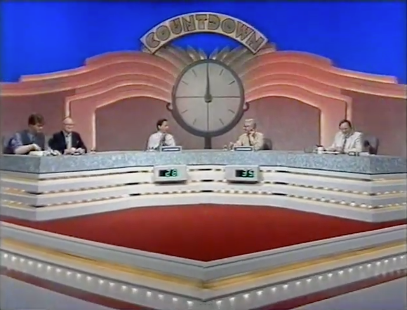
Unsurprisingly, the predominant feature of the wings design was the number of flamboyant, chevron-styled curves emitting from the centre of the studio, which were perhaps inspired by a bird in flight. They were believed by some to have paid homage to the logo of the show's production company at the time: Yorkshire Television. Hundreds of lights were installed within the wings, flashing in sequence during the credits and on occasions when a nine-letter word was found. A comparison of the set by Richard Stilgoe — the Dictionary Corner guest present on the set's debut episode — was to a 'head-on view of a seagull with a clock on its nose.' The main portion of the set continued to be stationed on a raised diamond platform, which too had an array of lights underneath. While the platform had a central void on the preceding set, it was now filled in and carpeted over.
Where the desk was separated into four smaller tables on the wooden set, it was merged back together for this design (and every other that has since followed), perhaps to give more inclusion to those sitting behind it. In this instance, it had a tiered setback configuration and was constructed as four angled sections to distinguish the allocated position of the cast members: the Dictionary Corner duo, defending contestant, challenging contestant, and presenter. The two inner sections had a rectangular seven-segment LED display mounted on the front to show the score of each contestant. For further aesthetic, more lightbulbs were arranged inside of the desk's three layers.
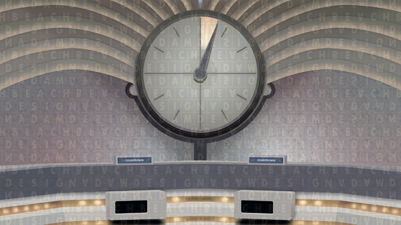
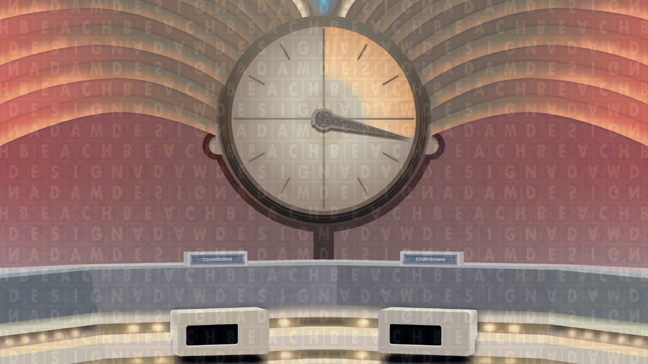
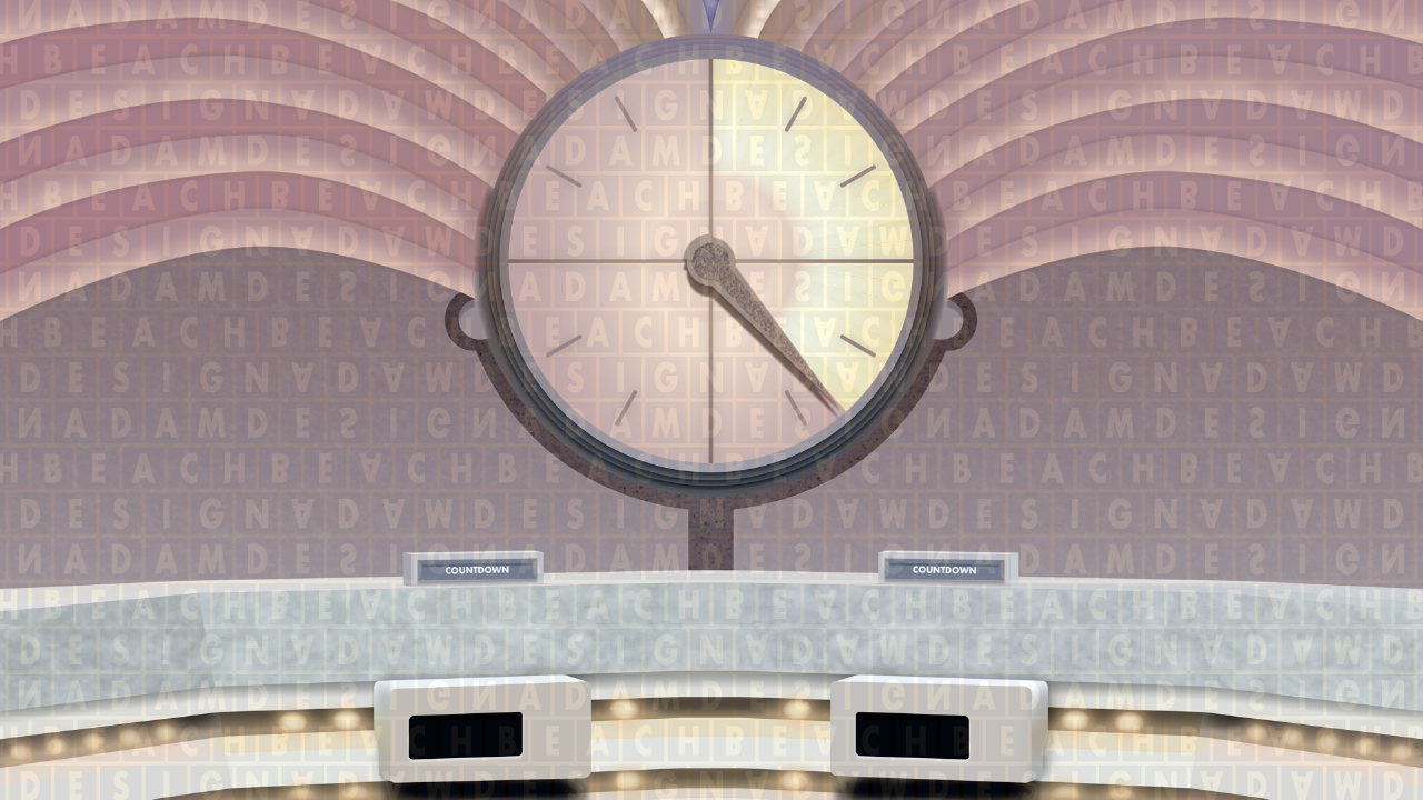
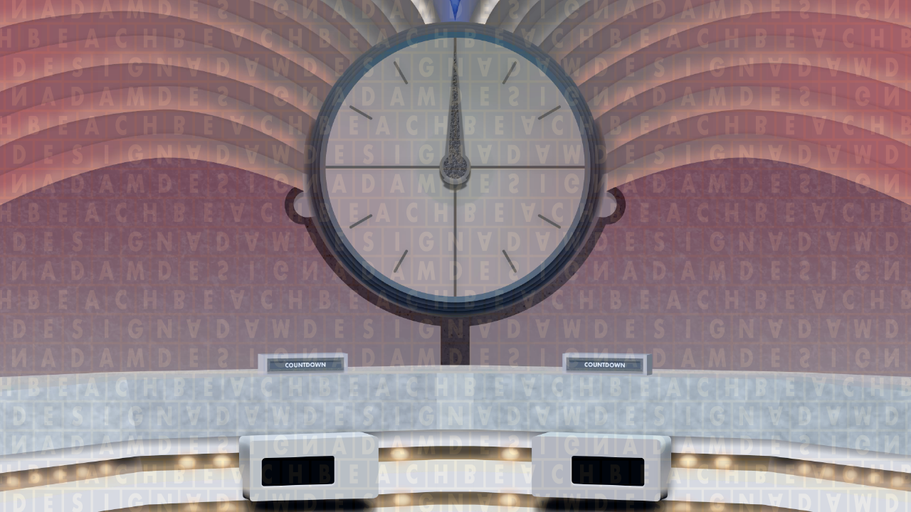
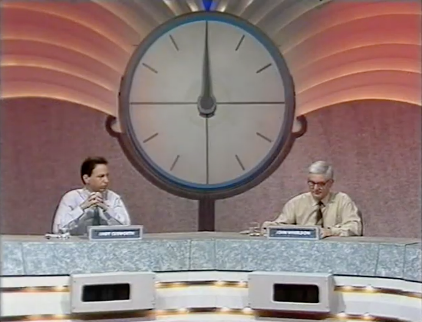
For the first time, the clock rested inside the many complex layered sections that made up the wings, as opposed to protruding from the walls of the studio, and were framed with two 'arms' around the perimeter of the bottom half.
The boards used during the rounds were situated to the immediate left of the main setting. They were embedded into a large stage flat depicting a grey background with arched lines branching from them. The numbers tray, storing the 24 tiles used for the numbers rounds, was remodelled for this set onwards to include individual pockets for the tiles to slip into as opposed to just four rows for them to lie on.
─ ─ ─ ─ ─ ─ ─ ─ ─ ─
Changes
Like every other style, the red wings set went through a series of changes, some more noticeable than others. The earliest of these was the lighting being messed around with. The first variant, seen throughout Series 22, was predominantly brown with hints of pink. After that, the remaining series with the set in use had it lit in various shades of red depending on the lighting configuration (apart from in Series 24, where it was flooded with grey). An example of a vibrant setup was during Series 23 in early 1992.
For some unknown reason, perhaps to add tension, there was a period in 1994 where the clock music was played approximately 10% slower, resulting in a lower pitch. This was only temporary, and the standard version was reinstated shortly afterwards. The brief change could have foreshadowed the remix to the music that would come in 1996, which intended to provide more intensity to the gameplay.
From Series 25, a large light-up sign was fitted above the clock, portraying the "Pac-Man" logo in use at the time. The desk was also modified with extra pieces slotted between each main section in order to expand it. In the following series, the border around the clock was recoloured from grey to blue.
─ ─ ─ ─ ─ ─ ─ ─ ─ ─
Discontinuation
The grand final of Series 30 was the last episode in which the red variation of the wings set was seen. Beginning in Series 31, which started on 1st January 1996, it was filtered blue. The set alteration prompted another rebrand for the show, comprising a triangular logo in addition to a new, "jazzed-up" edition of the clock music that lasted just twelve episodes.
─ ─ ─ ─ ─ ─ ─ ─ ─ ─
Gallery
Lighting setup for Series 22 (July–September 1991).
Lighting setup for Series 23 (December 1991–March 1992).
One of the 1994 lighting setups.
One of the 1995 lighting setups.
Examples of the clock in the red wings set
Screenshots from my 2018 uploads on YouTube, which are yet to be updated.
Overlay of the set: notice the off-centred sign
Clock shot
Left side shot
Right side shot
Various shots of the red wings set
Sources: screenshots from episode 1647 on YouTube.
─ ─ ─ ─ ─ ─ ─ ─ ─ ─