
Succeeded by: wooden set
The first ever episode of Countdown was broadcast at 4:45pm on 2nd November 1982. It was the first programme to be shown on Channel 4 and remains one of the longest-running game shows on British television. In 2014, after reaching its 6,000th episode during Series 70, it received a Guinness World Record for "the most series broadcast for a TV game show".
With Countdown at the helm of Channel 4's opening night, the first episode drew in almost four million highly anticipated viewers across the United Kingdom and Ireland. While it reportedly lost around two-thirds of its viewership come the second night, it's managed to retain a slot in Channel 4's daytime lineup for 40 years, continuing to be shown every weekday.
──────────
Set design
Upon its debut, the programme's commissioners were convinced that it would be pulled within weeks of broadcasting, therefore saw little reason for an excessive production budget. A consequence of this was the tacky presentation of the original set: drilled-in, uneven screws were noticeable around the border of the clock, while the letter and number tiles used during the rounds were stuck onto the boards by a thin magnetic strip that sometimes caused them to fall off during filming.
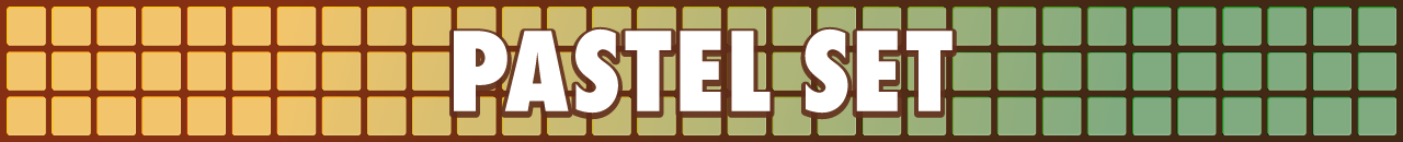
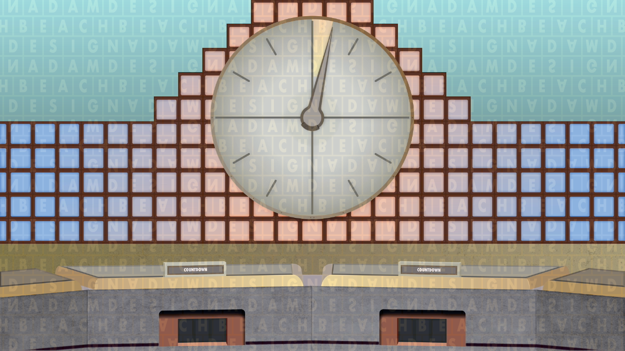
The walls of the original studio design were composed of segmented brown grid frames, angled to create a makeshift curve around the entirety of the main set area. The frames had cutouts for five long rows of round-edged squares; in the centre, and at both outer ends of the studio, the squares tapered in a 'stepping' formation to make a pyramidal arrangement of blocks. To produce the coloured tiles effect seen on-screen, a series of light panels were fixed behind the frames and were illuminated in a gradient between two colours — the inaugural variant, featured in the show's first two episodes, included pink transitioning to blue (from the centre outwards). The set stood in front of a curtained backdrop, which was also lit up during production. With the light panels being colour-changeable, the tiles and backdrop were tinged differently almost every episode, with some colours — particularly the pink and blue of the original setup — being repeated. Overall, it's likely that over a hundred colour combinations were seen throughout the seven years the set was around for, hence the reason for the 'pastel' nickname I use when referring to this era of the programme's history.
In the heart of the studio was a blank analogue clock face, complete with a red-bordered grey hand and (oddly) 54 light bulbs. After a few episodes, lines were stuck over the clock face at five-second increments to indicate how much time had passed during the countdown sequence. Initially, there was some deliberation between the producers with regards to how long the rounds would last, as some had used a 45-second timer in the Yorkshire-only Calendar Countdown series aired prior. Ultimately, the left half of the clock ended up being rendered useless for the rounds after the decision was settled for all of them to last 30 seconds, with the clock hand stopping at the bottom once the time had expired. A proposal was made to have it rebuilt with just half a face, however the show's poor budget prevented this from happening. Furthermore, the hand utilised the left side to reset between each round. As it transpired, the clock retained its full circular appearance and thankfully remains that way today. The original clock model was in production for just over 30 years, having been used all the way up until mid-Series 69. It was eventually replaced in September 2013 after conking out, by which time the hand had noticeably been resting on the left side for several months. It can now be found on display in the foyer of MediaCityUK's dock10 studios in Salford Quays, where the programme is currently recorded.
▸ Later changes: apart from the clock markings and contestants' nameplates, which were absent for the first few shows, there weren't any immediate changes made to the pastel design. The first noticeable difference came in 1985, when the two-digit LED scoreboards were replaced with three-digit displays after it was realised a player could accrue more than 100 points in the 14-round format used in specials and series grand finals — this nearly occurred in the grand final of Series 3 when champion Andrew Guy completed the game on 92. For unknown reasons, the two-digit scoreboards were reinstated towards the end of 1985, but were removed again in the next series.
In the second episode of Series 10 (episode 446, broadcast on 14th October 1986), an arc-shaped "tail" was fitted on the end of the clock hand. It's unclear why this was actually done, since it had no purpose, but it was likely for aesthetic reasons by it creating a drop shadow effect as the hand turned.
The first distinct refresh came in 1987, commencing ahead of Series 11. This saw the letter and number tiles be redesigned into a more visually appealing blue and white configuration, replacing the previously used grey and yellow. Typeface wise, Futura Condensed Extra Bold replaced the ambiguous Cairo font on the tiles, and Rockwell Bold on the nameplates, both of which had been used since the programme's inception.
▸ Discontinuation: on the standard daytime show, the pastel set's run concluded at the end of Series 17 on 17th March 1989 (episode 867), after which it was replaced by the short-lived wooden design. It continued to feature in episodes of the early morning Countdown Masters series that were filmed prior to the set overhaul taking place, meaning the final colour variant would have been shown sometime between 1989 and 1990.
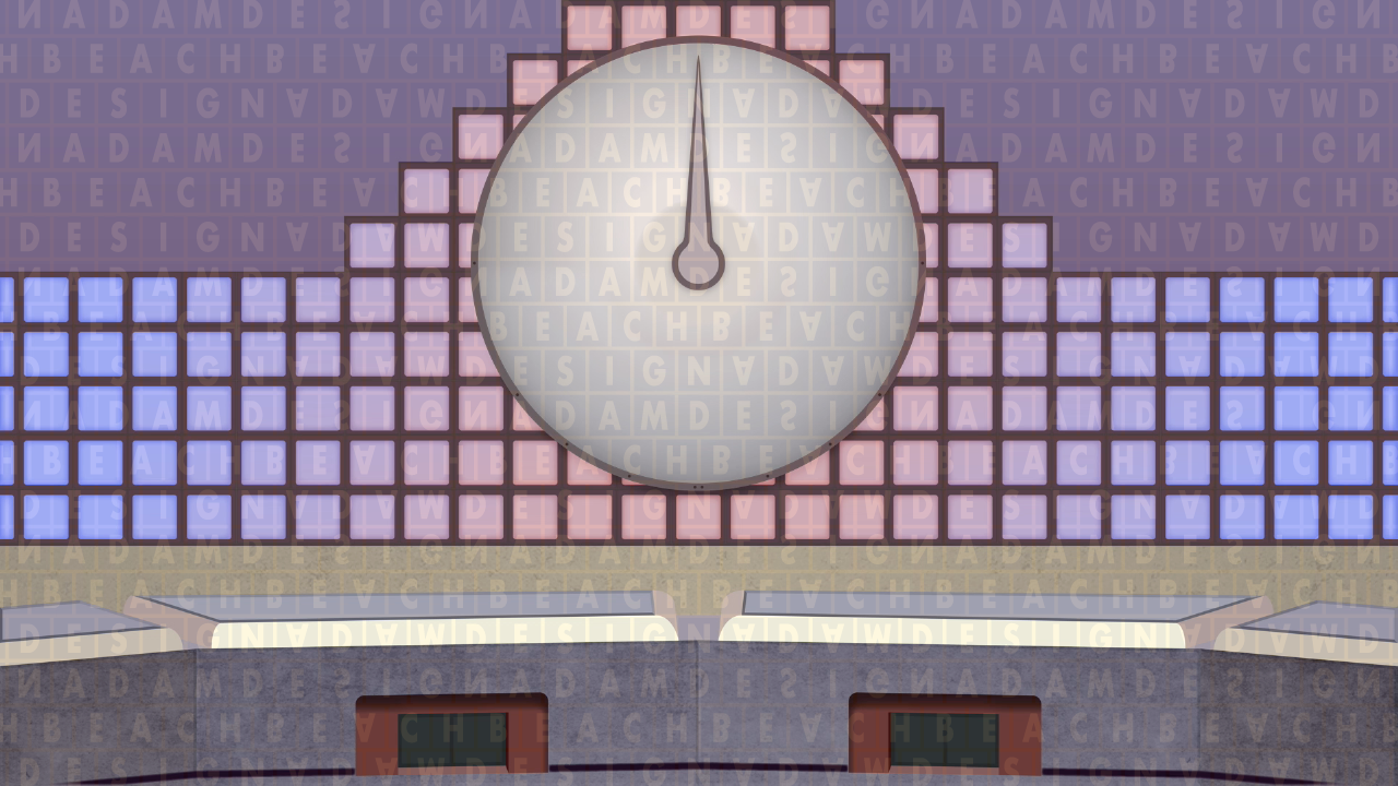
1982: the inaugural variant with the blank clock face
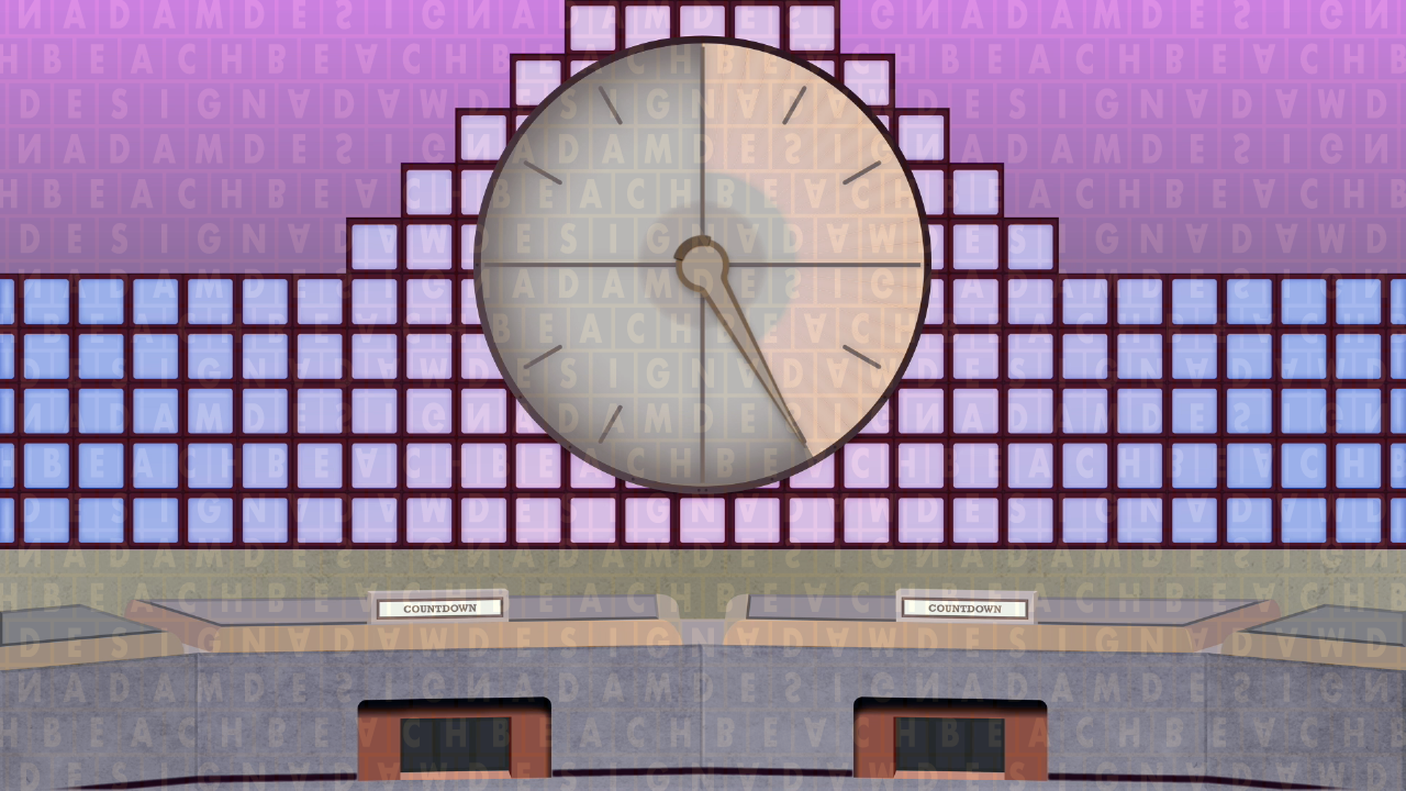
The colour scheme from 31st October 1986
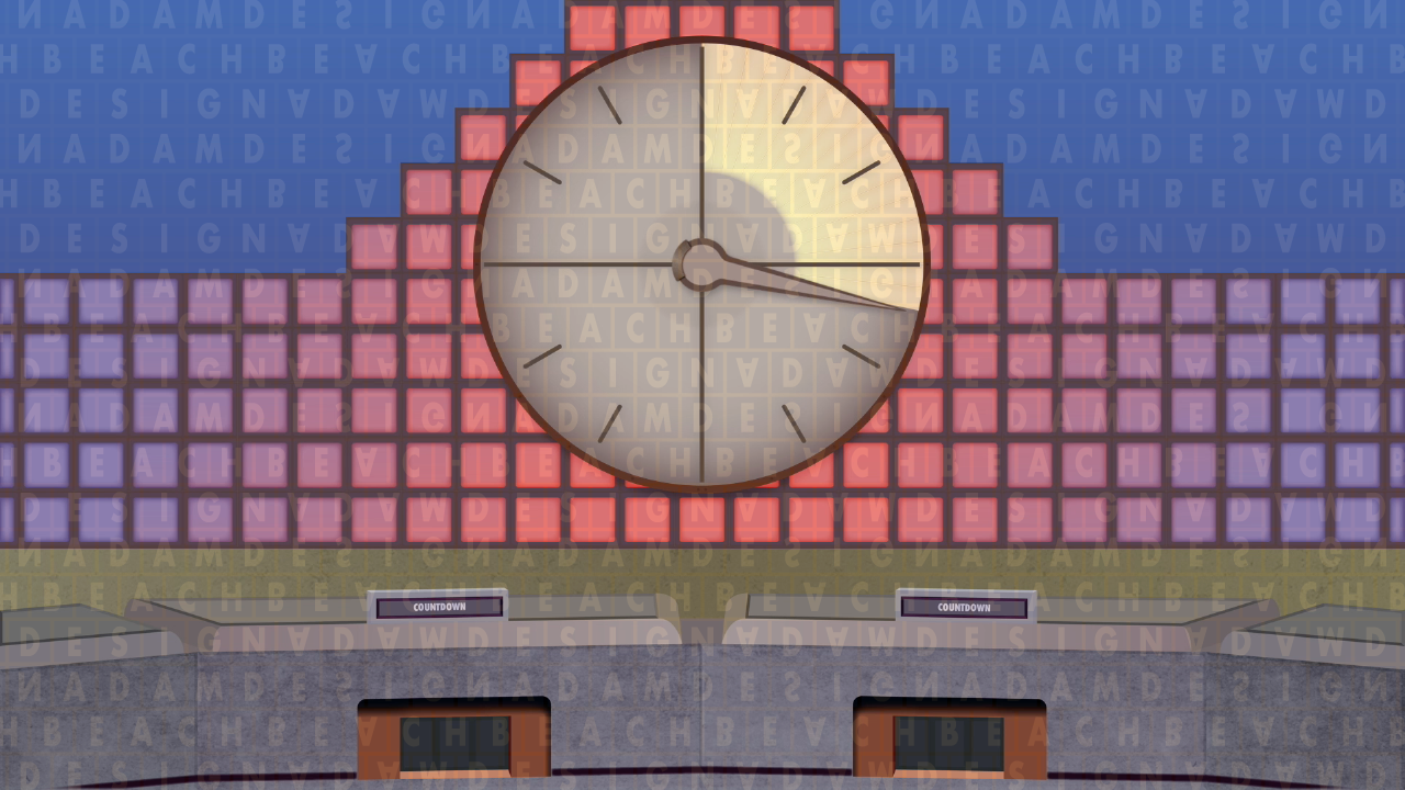
The colour scheme from 14th April 1987
The colour scheme from 3rd May 1988
Examples of the clock in the pastel set
Screenshots from my 2018 uploads on YouTube, which are yet to be updated.
──────────
Letter and number tiles
On Countdown, the letters and numbers have always been represented by physical cards. Currently, the letters measure 14.6cm², while the numbers are slightly shorter in height.
In the case of the letters, these are separated into decks of vowels and consonants, which the selecting contestant of the round will ask for, conventionally one at a time. The requested letter type is taken from the appropriate pile and placed onto the board until nine have been chosen. The tiles have magnetic backing in order to be positioned upright without falling off and to be easily rearranged to display a word at the end of the round. Regardless of this, there were regular occurrences in the show's early days where they did fall off the board, most commonly during conundrums if the board rotated harshly.
The numbers are made up of 24 tiles located face-down on a tray consisting of four rows. The four cards on the top row are what are known as the "large" numbers — 25, 50, 75 and 100 — while the remaining twenty are two lots of 1 to 10. These are also magnetic, and have additionally included a printout of the Countdown logo on the reverse since the unveiling of the pink stripes set in 2003.
The tiles have had a number of distinctive appearances over the years — the standout being the original — but have remained roughly the same since the start of Championship of Champions V in 1991. Only the numbers have changed since then, done so to match the point size of the letters.
▸ Original design: between Series 1 and 10, the text in the letter and number tiles had a vintage look, being stylised in the heavyset slab serif font, Cairo. The choice to use this font was questionable: its serifs and overall thickness meant contestants and viewers may have mistaken certain letters for others if they missed them being read out — notably, 'K' with 'X', and 'V' with 'Y', due to the similarities between each pair. On top of this, the fact that television sets were smaller in the 80s, coupled with the lower quality of studio cameras back then, furthered the unreadability of the letters for people at home.
The number tiles matched the style of the letters, but had the characters set in a smaller point size in order to accommodate the additional horizontal space taken up by the three digits of the '100' tile.
Perhaps as a result of the above-mentioned issues with the letters, Cairo was not used to display the names of the contestants on their nameplates; instead, these were written in the more commonly seen (at the time) Rockwell Bold.
▸ Series 11 to 17: effective from Series 11, the tiles were redesigned into a blue and white combination. Here, the characters were rid of the serifed strokes and replaced with the cleaner Twentieth Century Ultra Bold Condensed font, which improved on the poorer readability of Cairo. Despite this, the substantial amount of vertical space taken up by the letters meant the 'Q' — the tallest of the uppercase letters in the font — had to have its "tail" shortened to let it fit, therefore giving the letter a close resemblance to an 'O'. Also, due to this, the 'Q' was noticeably offset from the baseline, with the highest point nigh on touching the tile's top edge.
This design was originally discarded at the end of Series 17, after which a red and white scheme was introduced with the show's wooden set. When it was discovered that the new colour scheme would be problematic for epileptic viewers, the show immediately reverted to these. Like the original set, these tiles would have made their final appearance in one of the Countdown Masters transmissions between 1989 and 1990.
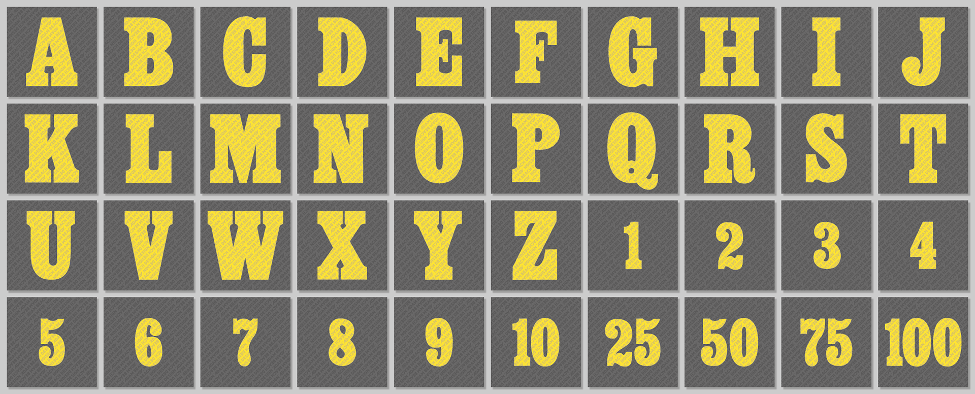
Series 1 to 10.
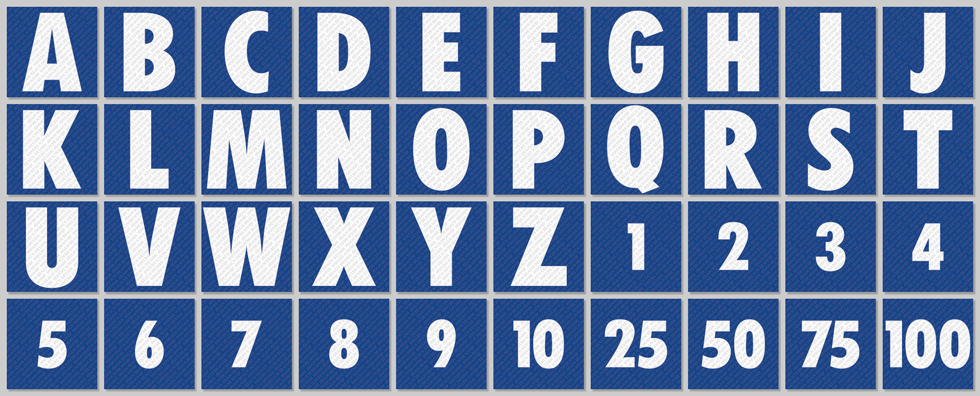
Series 11 to 17 — notice the 'Q' with the chopped tail.
The appearance of the tiles featured during the pastel set era.
──────────
Related pages
▸ Wooden set — succeeded this design