

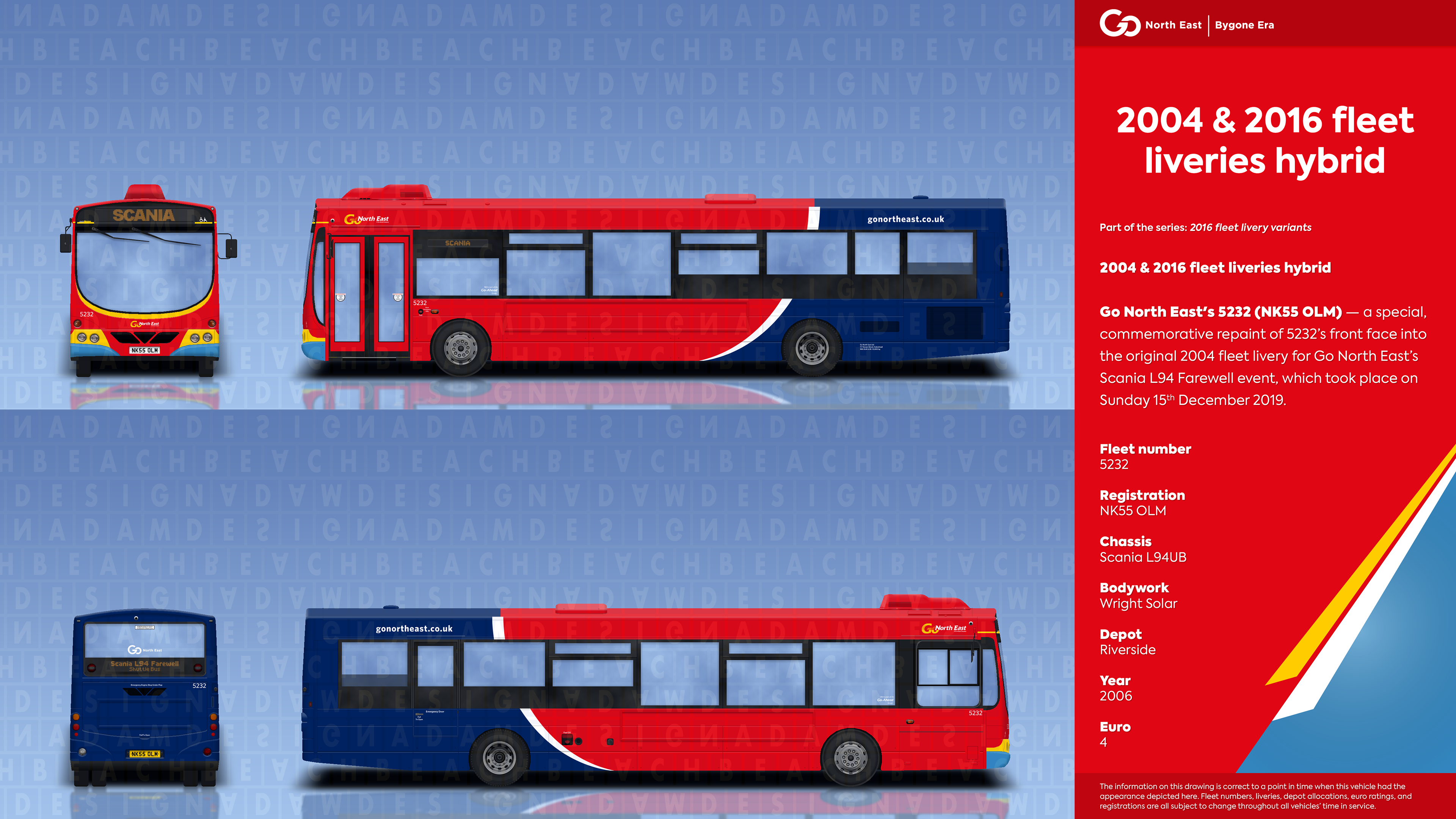
In 2016, Go North East underwent the first major transformation to its corporate identity in several years. Having been the first rebrand that the operator had developed since the early 2000s, it saw the unveiling of a new logo, fleet livery and an overhaul in marketing content through social media and via the app to promote their services more effectively.
▸ Livery: the most noticeable change with the rebrand was the presentation of vehicles: a brand new, two-tone base livery was unveiled which featured Go North East's traditional red colour towards the front of the bus, and a dark blue at the back. These were separated by a single white swoop.
Use of the new corporate livery was applied to vehicles primarily allocated to unbranded services, although many of the vehicles that already included Go North East's premium features had become designated spares for brands such as "The Crusader" and "The Red Kite" for when the correctly-branded examples weren't available. This enabled customers who regularly used the services to enjoy their journey with the facilities they had become accustomed to, as opposed to an older, lower-spec bus. Later down the line, high-spec examples gained a series of promotional circle stickers, which were lined up along the bottom of the front window to outline the onboard features that were available on the vehicle.
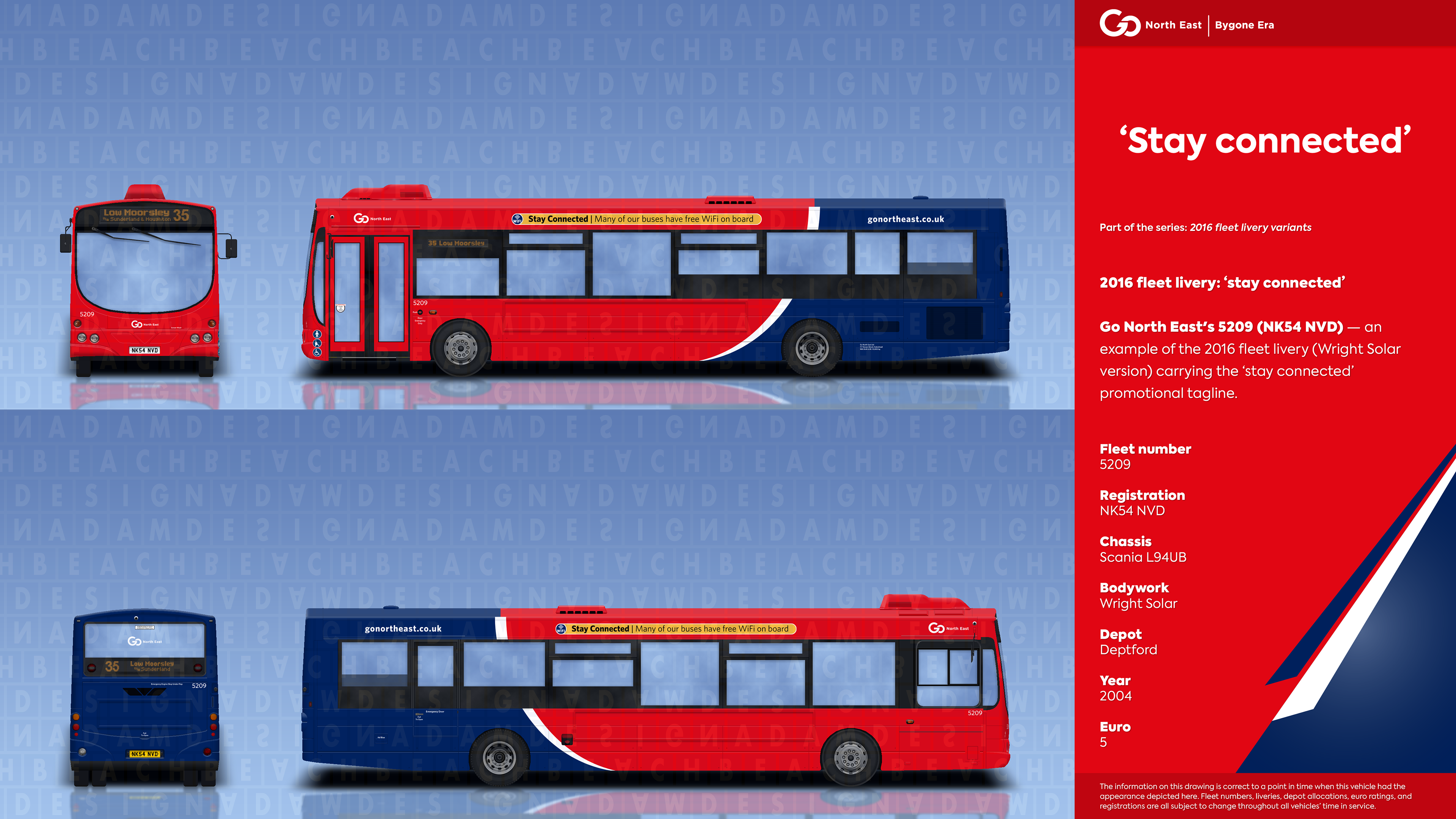
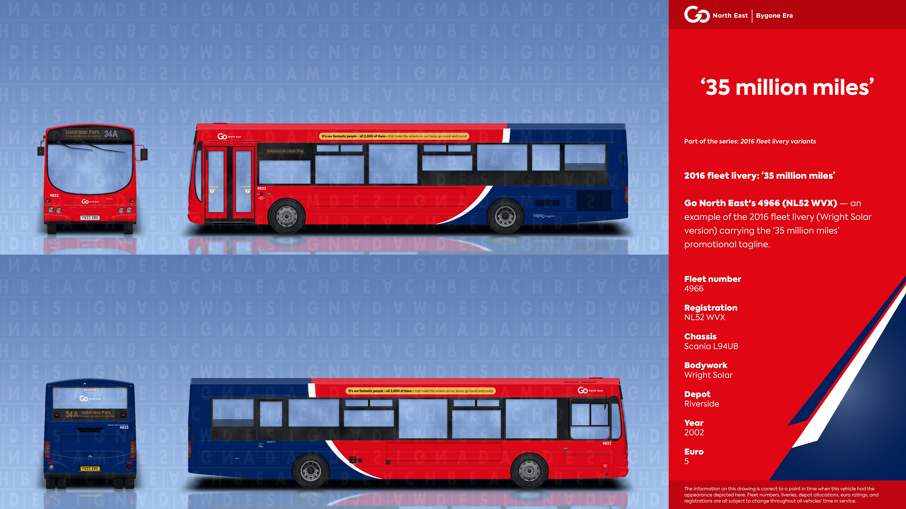
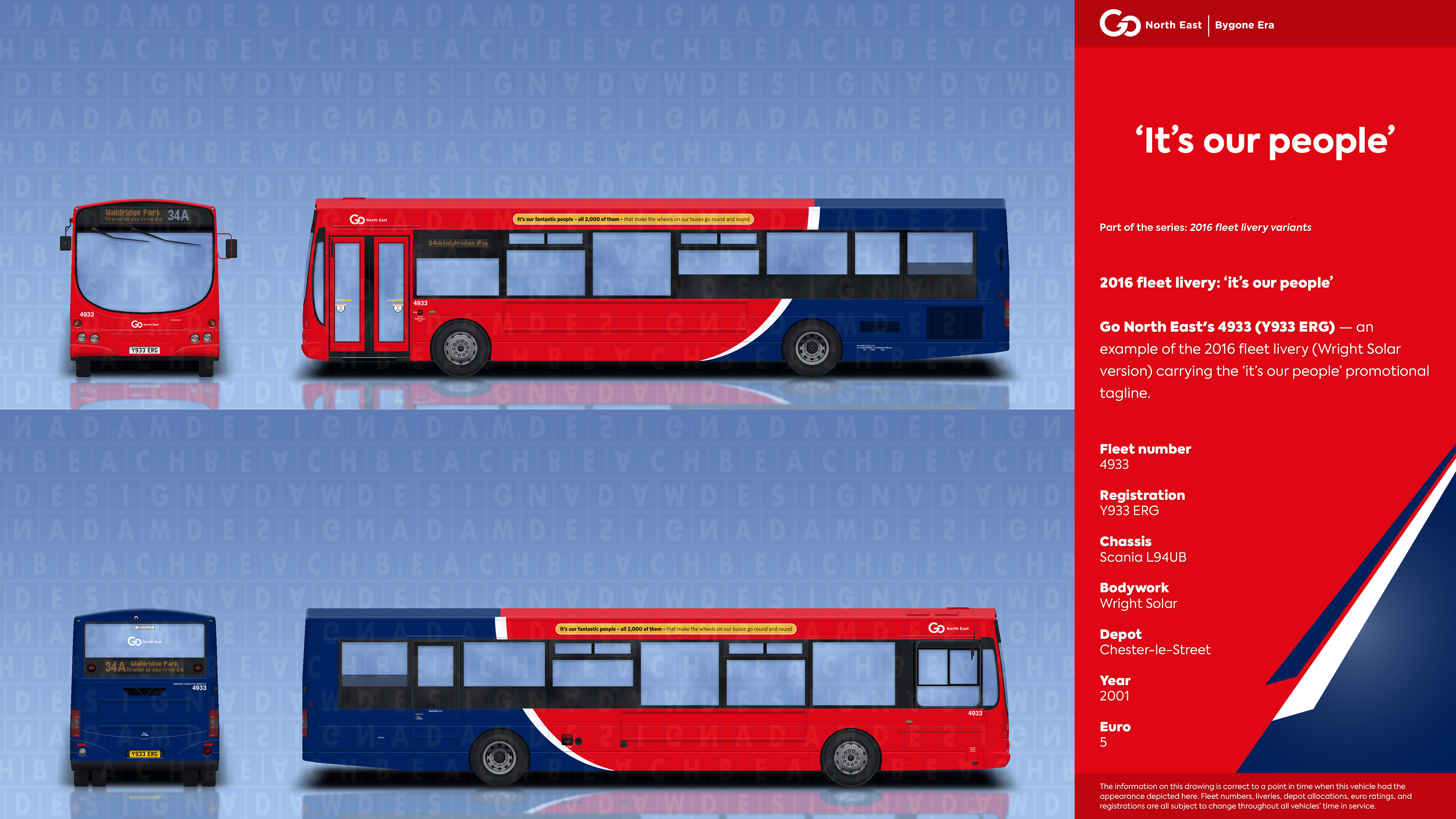
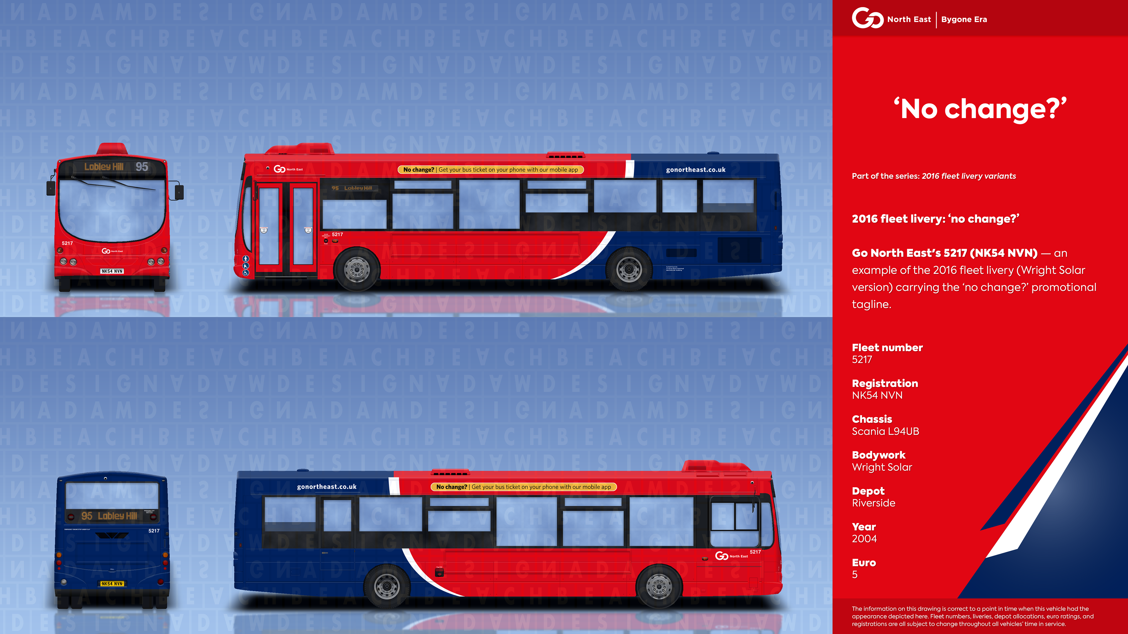
Shortly after the release of the new corporate design, various orange taglines began to appear on the sides of vehicles carrying the livery in order to reflect Go North East's dedication to their staff and customers, and to promote the aforementioned premium features included on board many of their buses. Overall, six different taglines were scattered across the fleet and contained messages of 'Stay Connected': advertising the free WiFi available onboard; 'Never miss your stop': highlighting the use of audio-visual next stop announcement systems for customers unfamiliar with the route or with sight/hearing impairments; 'It's our people': praising the 2,000-strong Go North East staff, particularly drivers and engineers, working around the clock to keep the vehicles running on a daily basis; 'No change?': outlining the contactless payment facility on all buses and ticket purchasing via the app; '35 million miles': informing customers of the incredible distance that Go North East buses travel every year (roughly the distance of going to the moon and back 72 times); and 'Recharge your batteries': promoting the plug sockets and USB connections that allow customers to recharge their mobile devices.
This rebrand also saw Go North East's first significant logo change since 1998, with a complete transformation from an italic, serif typeface into the contemporary and visually appealing Gotham. On the new logo, rather than the words 'North East' intersecting the word 'Go', the three words were separated to form more of a legible appearance for customers. Using the new typeface in the logo was Go North East's way of keeping up with modern branding trends, while keeping customers drawn to their services at a time when major competitor Arriva was also in the works of unveiling a new corporate identity.
▸ Vehicles: almost every vehicle type in the fleet had a least one example carrying the 2016 fleet livery, given that it was the standard identity for any vehicle that wasn't to be given promotional branding for routes.
▸ Discontinuation: to coincide with the opening of Consett's new Hownsgill Depot in May 2019, Go North East announced a second rebrand in under three years. The rebrand set out to promote uniformity on each of the company's vehicles through the incorporation of two 'roadstripes'. The new design preserved the red forward colour used in the 2016 version, however the blue towards the back was now a lighter shade to the midnight blue used beforehand. Paying tribute to the original 2004 fleet livery, the style once again carried yellow as part of its colour guidelines, featured on the shorter of the two 'roadstripes' separating the red and blue base colours.
After the rebrand was announced, the 2016 fleet livery became defunct and started to be phased out. By the end of the following year, almost half of the entire fleet carried the newer style due to Go North East dropping many of its promotional brands across the network. In a sense, the 2016 fleet livery was retained on vehicles that needed amending from mid-2020, as financial constraints meant it wasn't feasible to have every example repainted with the lighter blue rear colour. As such, those that weren't repainted had the white swoop stripped and were given the two 'roadstripes' over the darker blue colour.
Scania L94UB/Wright Solar variants


Date last modified: 2nd August 2021
Related pages:
▸ 2019 fleet livery — replaced this fleet livery [coming soon]
If you have any other information to contribute towards this page, feel free to contact me on one of the links provided below.