
Blockybus is a digital content creator and streamer, specialising in transport simulation games and photography. He attends bus rallies and events across the North East of England, and is the producer of a series of 'repaints' in the bus simulation video game OMSI 2, where he predominantly replicates pre-established livery designs of operator Go North East.
Liam, the channel's creator, approached me to design a new logo and branding style for his content, which I gladly took on the task of doing. His intended outcome was consistency across his social media platforms, and an icon that allowed for flexibility and easy recognition.
Previous branding
Blockybus's old branding style was inconsistent, having used an assortment of logos that were often changed depending on the content being produced. At least three logos were used in rotation before I was asked to develop the new design.
Apart from the word 'bus' in the title, there wasn't really anything to convey what the channel's content was, although an illustration of the front face of a silver Mercedes Citaro vehicle was later integrated onto the channel branding via the profile picture.
The principle logo gave off an ongoing Halloween vibe by consisting of a black and white wordmark format against an orange backdrop. It was written in sentence case and displayed in Aachen Pro Medium, a heavyset slab serif font. Each of the letters were given a thick white stroke, leaving some of them with narrow gaps and jagged edges that didn't line up, which didn't look appealing when put against the orange in the background.
Updated branding
The biggest problem I wanted to overcome was the colours involved. I felt that the brightness of the orange in the background was distracting, while the white stroke around the text in the logo was unappealing. After conferring with Liam, we decided to experiment with an inverted variant: the logo in orange against the black background. Liam preferred orange as the key colour, so I proceeded to tweak the text with different swatches until settling on a value that looked right against the new background, which had been modified into a charcoal grey. These shades were good enough to begin using in the final outcome, which Liam was likewise happy moving forward with.
The letter 'O' in the title became substituted by a steering wheel drawing, additionally replacing the bus as the channel icon. I believed the steering wheel concept would communicate more of Liam's work than the previous icon did — which focused solely on his bus-related content — to denote all of the work he produces. It's also the standout element of the logo because of its circular composition, which contrasts the blocky letterforms surrounding it. It was inspired by the common usage of steering wheel gaming accessories in many simulators today, in addition to the fact that cars, trucks and buses alike are controlled by them, all of which Liam has covered on his channel.
Final touches to the logo included the application of a horizontal two-tone effect on all of the letters to provide depth, which was achieved by increasing the brightness of the colours ever so slightly. Finally, to give emphasis on the content Liam posts, I offset the two words in the logo with differing colours: while 'blocky' sustained the orange, 'bus' was refilled in grey, lighter than the background but enough to contrast the adjacent orange.
Liam's rebrand went active on 20th March 2022.
Former logo and icon designs

The old logo, set to the dimensions of a YouTube desktop max banner (2560 x 423 px)

Old channel icon
Updated logo and icon designs
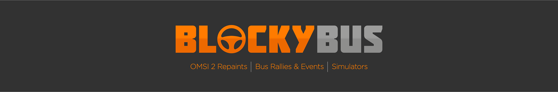
The new logo, set to the dimensions of a YouTube desktop max banner (2560 x 423 px)
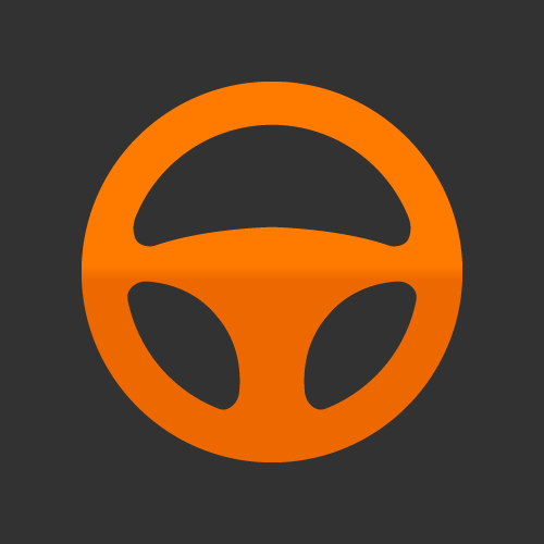
New channel icon
Feedback
Direct quote from Liam:
'A logo is one of the most important things about any business or brand, so it's important to get it right. In the past, I have had many designs made, but none of them have fit or met my expectations. Adam was very determined to make a logo that was perfect and something that I would like. He took all of my ideas and came back with a design that was exactly what I have been looking for. The logo looks very modern, stylish and something I know I'll be using for a very long time.
The best way to put it is that Adam is a perfectionist and makes sure he makes a design that both himself and clients are happy with, as well as meeting all of the objectives. Thanks so much Adam. I appreciate you doing this!'